Back to Home
Bright Kid Mont.
Bright Kid Mont.
UX Design.
UI Design.
Branding.
Edu-Tech
Edu-Tech








Timeline:
6 Weeks
Tools:
Figma & Framer
Role:
UX/UI Designer

Research & Analysis
Identifying improvements after comparison and trend check.
Dev Support
Iterations with the dev team to convert UI designs to Website.
Website
Landing page and Admissions page for the kindergarten.
Responsive Design
Making sure the magic has been seen across devices.

Research & Analysis
Identifying improvements after comparison and trend check.
Dev Support
Iterations with the dev team to convert UI designs to Website.
Website
Landing page and Admissions page for the kindergarten.
Responsive Design
Making sure the magic has been seen across devices.

Research & Analysis
Identifying improvements after comparison and trend check.
Dev Support
Iterations with the dev team to convert UI designs to Website.
Website
Landing page and Admissions page for the kindergarten.
Responsive Design
Making sure the magic has been seen across devices.

Research & Analysis
Identifying improvements after comparison and trend check.
Dev Support
Iterations with the dev team to convert UI designs to Website.
Website
Landing page and Admissions page for the kindergarten.
Responsive Design
Making sure the magic has been seen across devices.
Overview.
Overview.

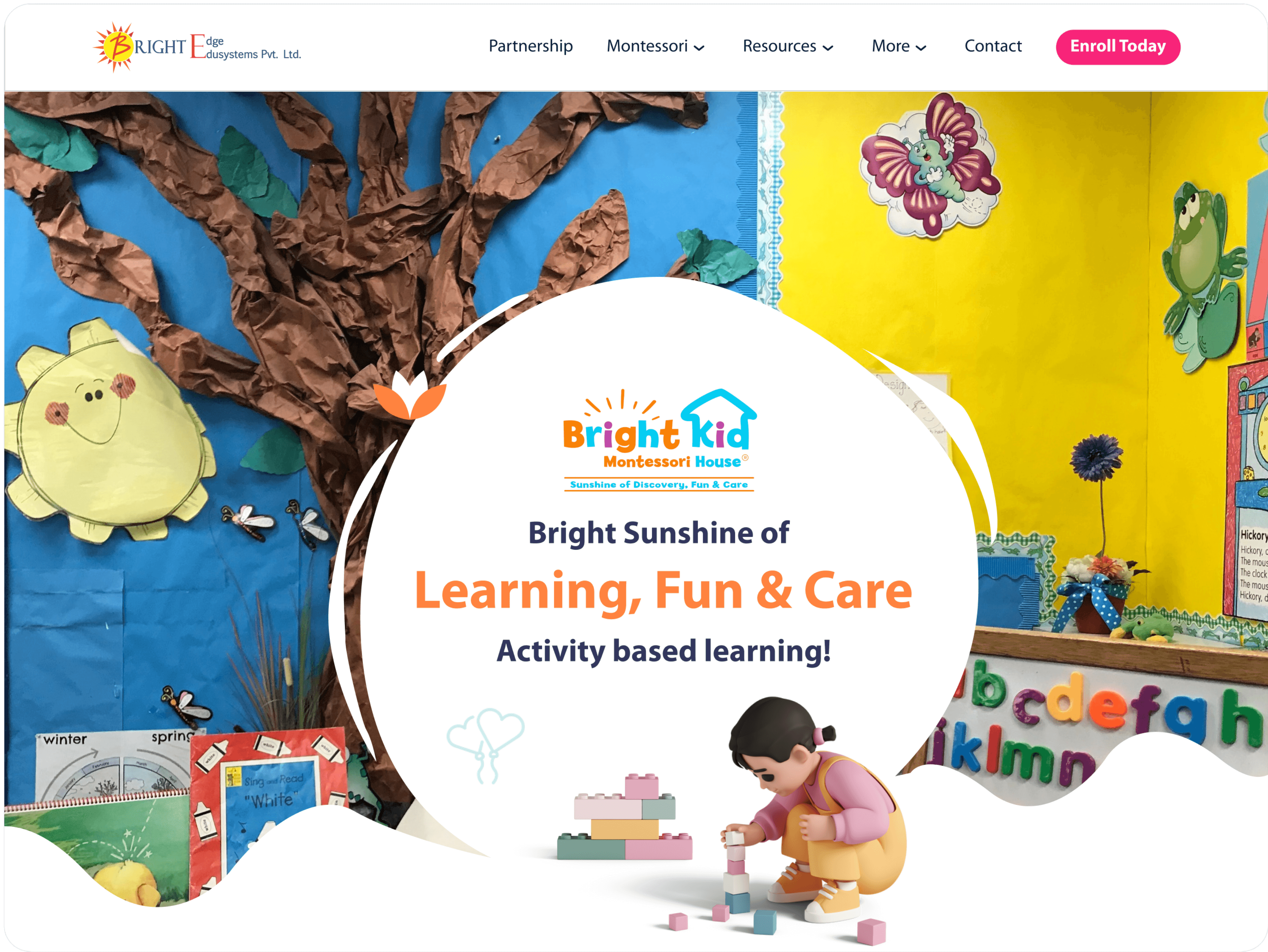
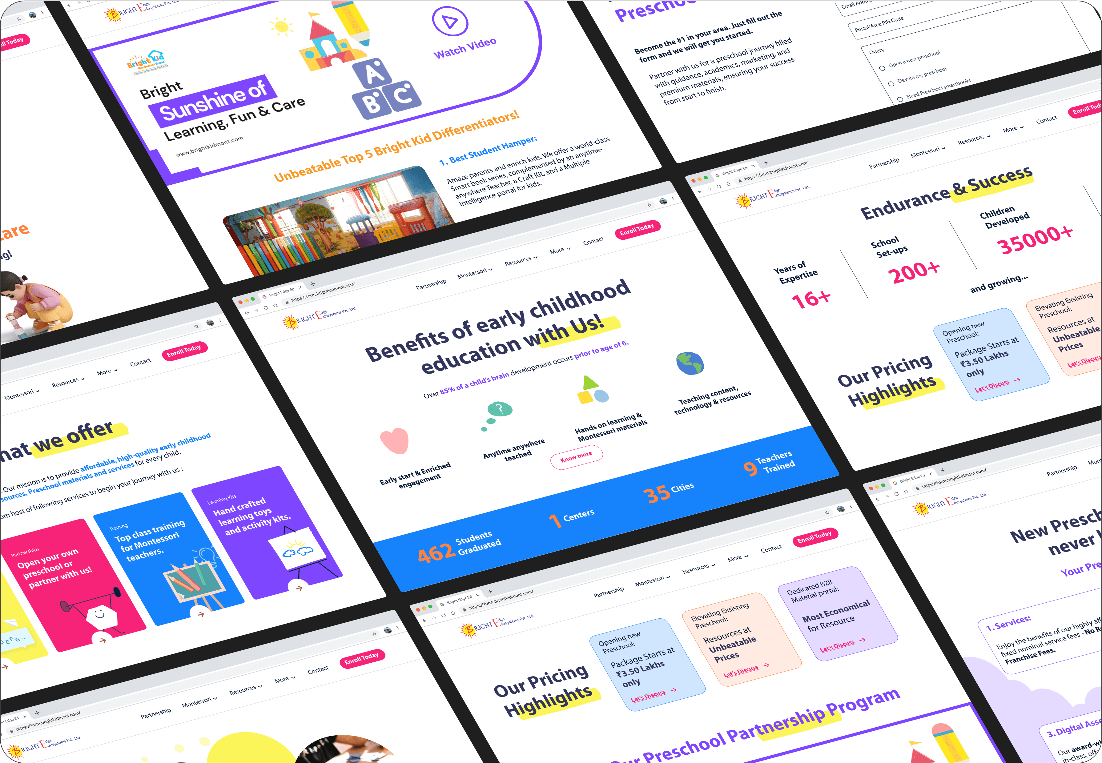
Bright Kid Montessori House is a well-known kindergarten, offering early education through the Montessori method. I was tasked with rebranding the school’s online presence and redesigning key pages, specifically the homepage and admission forms page, to increase user traffic and drive conversions. My role included collaborating closely with the client to ensure their requirements were transformed into effective design solutions.
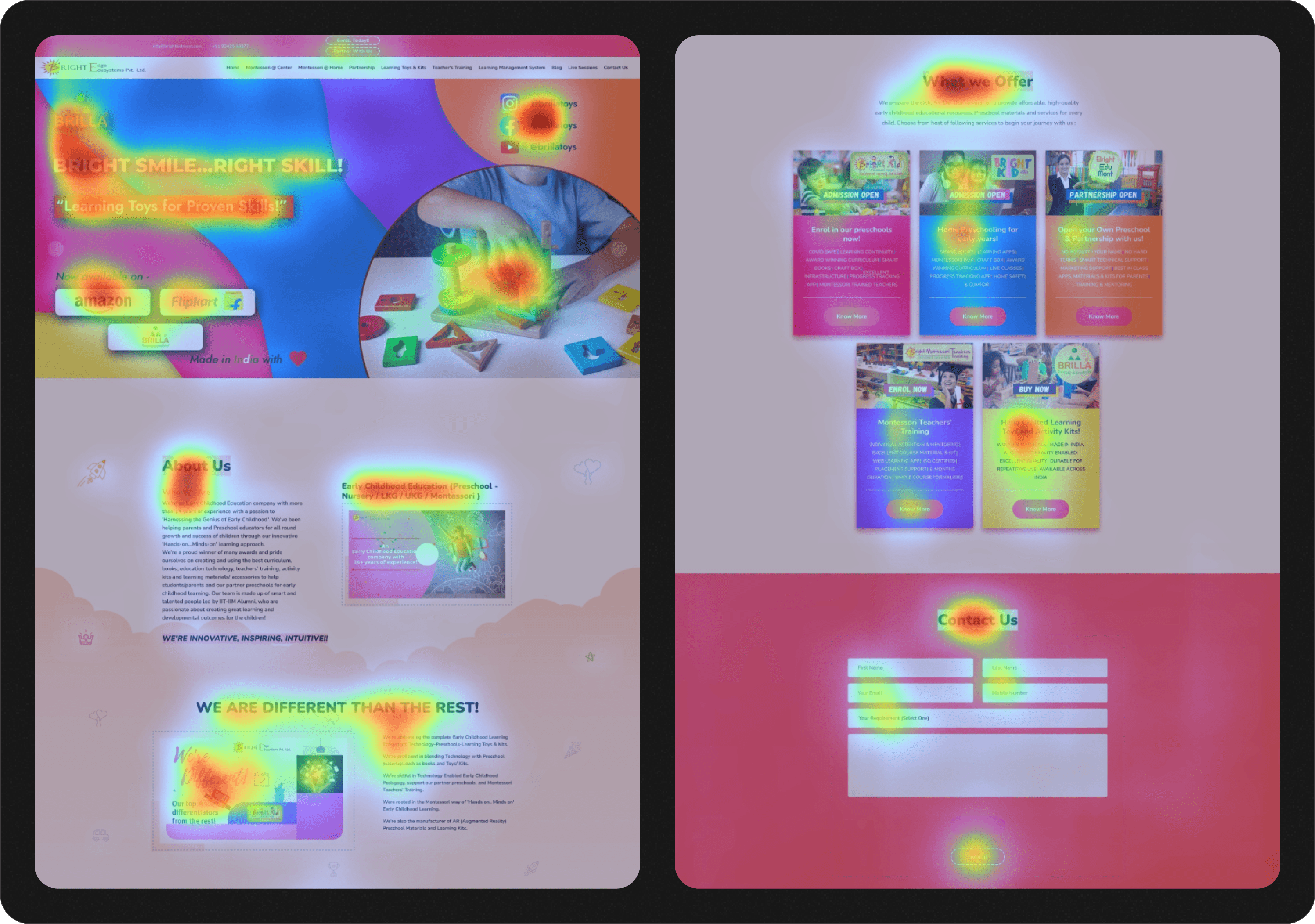
The existing website was outdated and lacked a cohesive brand identity. The user experience on critical pages, such as the admission forms page, was cluttered and difficult to navigate, resulting in lower conversion rates. The goal was to create a fresh, modern design that appealed to parents while simplifying the admission process.
Approach.
Approach.

The approach was two-fold: a complete visual rebrand paired with a user-centric redesign of key web pages to improve the user journey and overall experience.
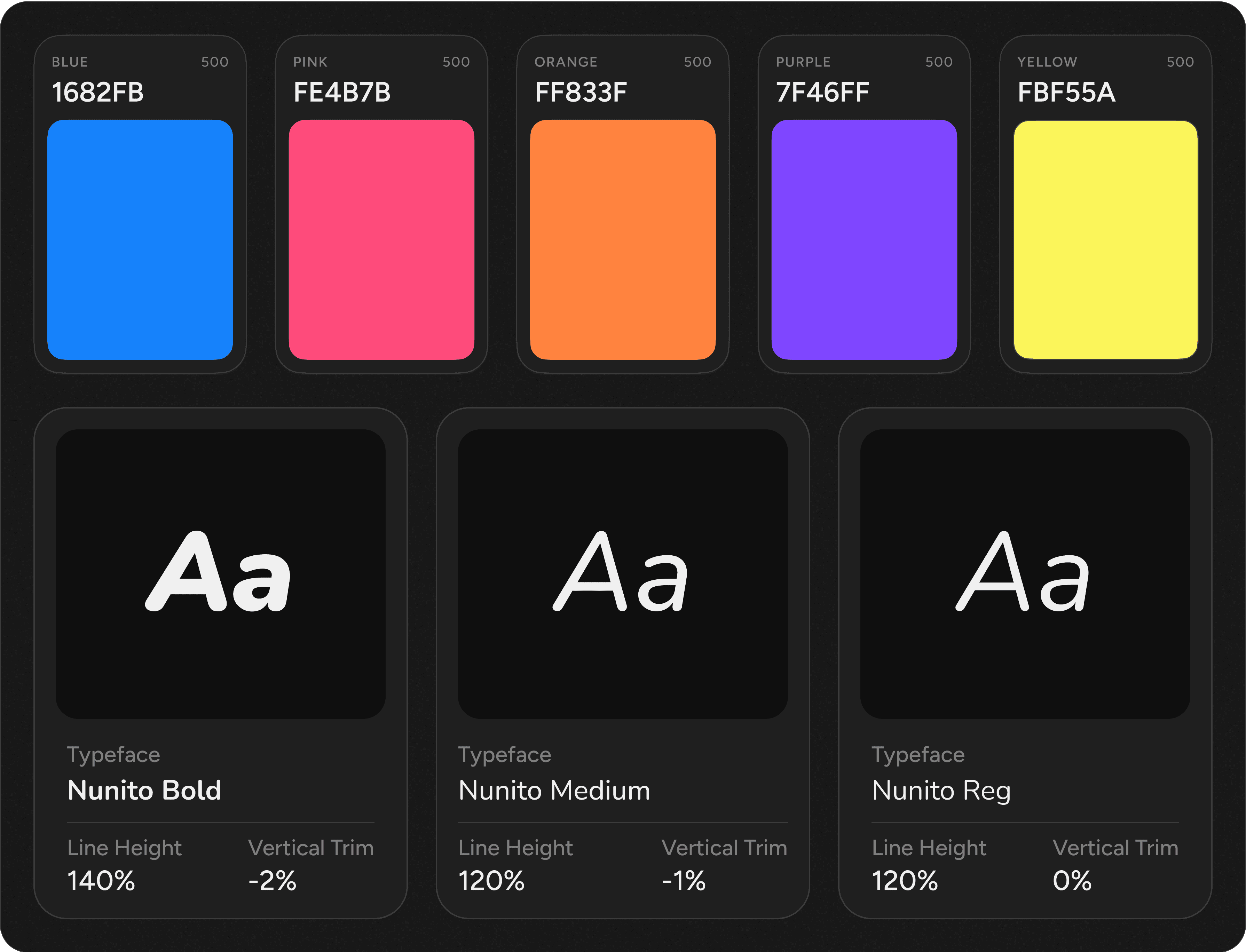
Rebranding: I developed a modern and vibrant visual identity that reflected the core values of the Montessori philosophy—child-centered learning, exploration, and growth. This included updating the logo, color palette, typography, and overall tone of the brand.
Homepage Redesign: The homepage was restructured to make information easily accessible, with intuitive navigation, visually appealing images, and a welcoming feel to capture the attention of prospective parents.
Admission Page Redesign: The admission form page was streamlined, simplifying the form fields and reducing friction for users. The design focused on clarity, reducing user fatigue by breaking the form into smaller, manageable sections, and making the process mobile-friendly.
Client Collaboration: I worked closely with the client throughout the project, gathering feedback at each stage to ensure that the design met their vision while aligning with usability best practices.
Heatmaps (Old UI).
Heatmaps (Old UI).


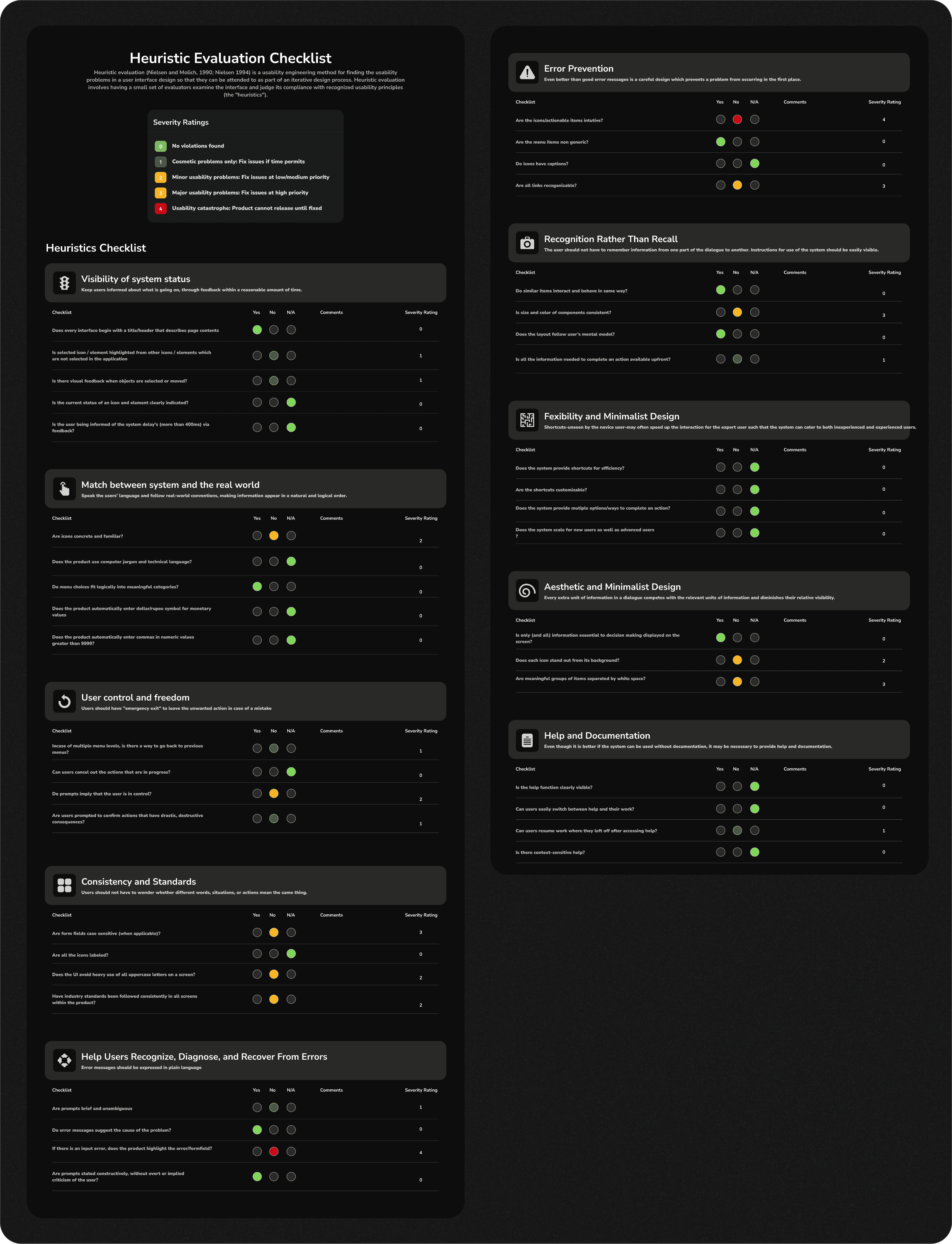
Heuristic Evaluation.
Heuristic Evaluation.


Style Guide.


Interface.


Conclusion.
Conclusion.

The Bright Kid Montessori House project allowed me to create a seamless blend of aesthetic appeal and functionality, resulting in a user-friendly website that directly addressed the client’s needs. By focusing on clear communication, efficient user flows, and engaging visuals, the redesigned website not only improved traffic and conversions but also strengthened the brand’s presence in a competitive market.

The Bright Kid Montessori House project allowed me to create a seamless blend of aesthetic appeal and functionality, resulting in a user-friendly website that directly addressed the client’s needs. By focusing on clear communication, efficient user flows, and engaging visuals, the redesigned website not only improved traffic and conversions but also strengthened the brand’s presence in a competitive market.

The Bright Kid Montessori House project allowed me to create a seamless blend of aesthetic appeal and functionality, resulting in a user-friendly website that directly addressed the client’s needs. By focusing on clear communication, efficient user flows, and engaging visuals, the redesigned website not only improved traffic and conversions but also strengthened the brand’s presence in a competitive market.

The Bright Kid Montessori House project allowed me to create a seamless blend of aesthetic appeal and functionality, resulting in a user-friendly website that directly addressed the client’s needs. By focusing on clear communication, efficient user flows, and engaging visuals, the redesigned website not only improved traffic and conversions but also strengthened the brand’s presence in a competitive market.
THAT’S ALL FOLKS
THAT’S ALL FOLKS
THAT’S ALL FOLKS
THAT’S ALL FOLKS
THAT’S ALL FOLKS
THAT’S ALL FOLKS